Statistical Metadata Visualization


Case Studies.

See KnoGlo's statistical metadata visualizations in action, and how these results are meaningful to us.

Example 1. Talk about computer

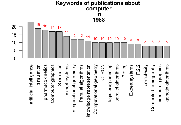
Keyword "computer". Top 20 results.


By running “Dataset-Generator-keyword.py”, we got some interesting results of how "computer" plays its role in scholar.
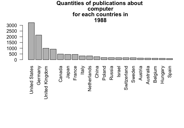
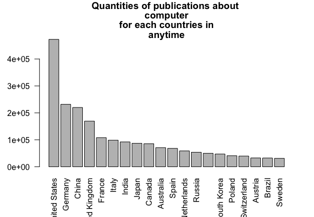
Country

I am not surprised that United States has the most publications world wide. Besides, China has a growing scene in the computer industry, that explained why it ranks No.3.
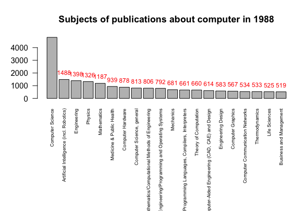
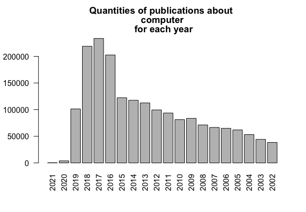
A generic square placeholder image with rounded corners in a figure.
The dataset showing the results of the constraint "country" and its counts.
A generic square placeholder image with rounded corners in a figure.
Results of the constraint "country" and its counts, in a bar plot.
Years

In the past 20 years, the number of publication per year is increasing, which could explain the growth of the computer industry.
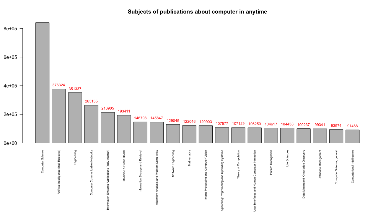
A generic square placeholder image with rounded corners in a figure.
Results of the constraint "year" and its counts, in a bar plot.
Subject

These represent specific subject collection for these documents.

Artificial Intelligence is definitely a hot topic. Also, Medicine and Public Health has a place in the world of computing.

A generic square placeholder image with rounded corners in a figure.
Results of the constraint "subject" and its counts, in a bar plot.

Example 2. Computer. In 1988.


We know that there have been more and more publications about computer coming out in the past 20 years. However, what about even earlier? Although the basic API plan only returns the top 20 results, we can add additional constraints as filters to see statistics of publications in a specific year.

“Dataset-Generator-keyword-and-year.py” could help you with that. By selecting keyword as “computer” and year “1988”, we will see a statistical result specifically in the time range of the year 1988.

Let’s look at these results.

The file “statistics_year.csv” has only one row for 1988, and it shows the number of publications from 1988 as total. We don't need to visualize this one in a bar plot, though.

A generic square placeholder image with rounded corners in a figure.
The dataset showing the results of the constraint "year" and its counts.

Then, let’s take a look at other attributes.

A generic square placeholder image with rounded corners in a figure.
Results of the constraint "subject" and its counts, in a bar plot.
A generic square placeholder image with rounded corners in a figure.
Results of the constraint "keyword" and its counts, in a bar plot.
A generic square placeholder image with rounded corners in a figure.
Results of the constraint "country" and its counts, in a bar plot.

Example 3. Speedrun: A study of, but not limited to, videogames.

Keyword "speedrun". Top 20 results.


Speedrun is a type of gameplay for video games that is aimed to complete a game as fast as possible.

By looking at "speedrun" from the Springer Nature database, we can see how it was mentioned in researches and its importance in the academic circle.

Example 4. rbokeh. Make graphs interactive.

Directly view your graphs on the web.


To answer this question:

"In which country, researchers show more interests in the field of digital media in the year 2017?"

See this visualization in rbokeh. This is an interactive graph exported in HTML format. You can move your mouse on data points to see more details.

More details coming soon.