Statistical Metadata Visualization


Implementation.

How it works? See our computational solution, as well as the source code.

One goal, three sentences.

Create datasets. Data management. Visualize it.


We want to create datasets of the statistics of academic publications from all over the world, manage, and visualize them.

Basically, we made a Python tool that is able to gather metadata from Springer Nature and create datasets of these statistics. As an optional choice, you can use LibreOffice to manage these datasets based on your purpose. Finally, you can visualize your datasets in R.

Where are the data come from?

Standing on the shoulder of giants.


Our tool is able to gather information from Springer Nature, which is one of the world's leading scholar database.

Powered by Springer Nature Metadata API that provides metadata for academic and professional publications, we could access 12 million online documents, including journal articles, book chapters, and protocols.

Using these data, we could analyze the statistic information about how many articles published in selected topic and time ranges.

So how does this Springer Nature thing works?

Take a deep look at the data output.


Springer Nature API supports several type of output, includes JSON and PAM (in XML).

For statistical data visualization, we are using both format for different versions. The Python tool is using the JSON output, and the web version works with XML and DOM.

RESEARCH PROCESS Springer Nature API has a Live Documentation page that helped me to understand the JSON output.

The API requires user to send a request with constraints added, in order to return an output based on constraints (can be understood as "filters") by users' choice.

For example, if a "keyword" constraint was added, the returned result will contain information about the publications that are related to this keyword. I found this out by testing several outputs through the live documentation. It turns out that these publications may or may not has a keyword tag that is the same as the constraint that I claimed, but this keyword appears in the title and/or abstracts in these publications.

pic here

Let's look at the output. The JSON data consists of two major parts - "records" and "facets".

We need to use the “facets” part for the statistical visualization. It includes the statistical data shows how many articles were published for each subject, keyword, country, publisher, and type (books or journals). In other words, we need to process the data from these six attributes (a.k.a. "constraints") in “facets”. Inside each constraint, there are two types of variables: “count” and “value”. “count” represents the number of publications associated with each “value”.

The “records” part includes the information of the top 50 publication itself, includes title, abstract, DOI, and so on. This part will be used for the Corpus Generator.

For the basic plan for the Springer Nature API, the top 20 results will be listed for each constraint.

Learn more about how constraints works in Springer Nature API.

The Python tool: works with JSON.

Our research challenge: get the data, and generate datasets.


This Python tool is able to gather and organize these metadata from the raw JSON output.

RESEARCH PROCESS Big thanks to Lanfei Liu, who built a tool in Python using Springer Metadata API and other APIs in order to generate literature review data. By learning her code, I figured out how to use Python 2 to gather data from the JSON output filtered by attributes (technically, this is called "query"), and create (write) CSV files for the output in table view.

See our source code in Python 2.

A simple interface in the terminal will ask users the Springer Nature API key, the keyword, and the year (optional). After user's input, those 6 datasets will be generated and being saved to a new folder. The folder name is your keyword (and the year, if applicable).

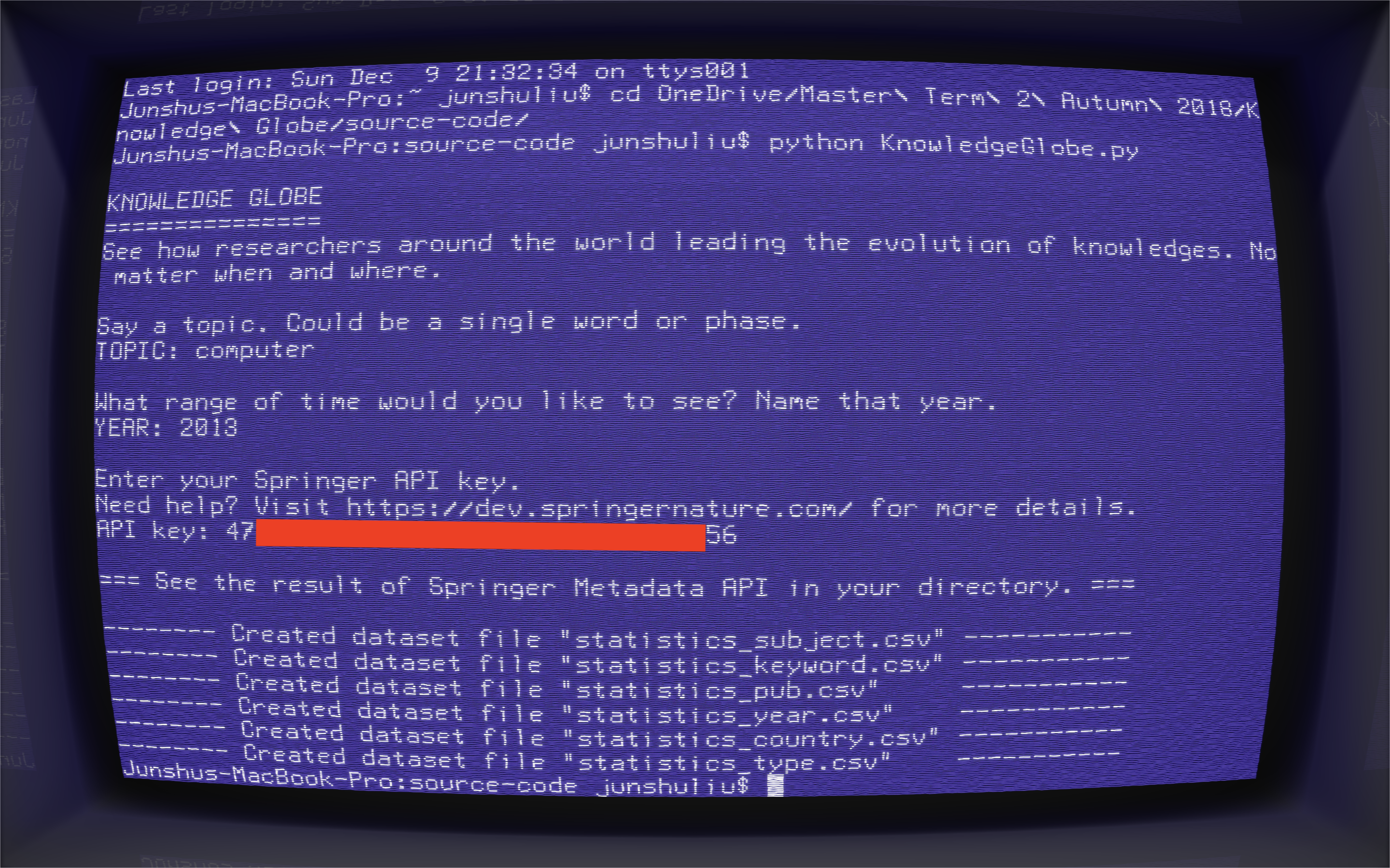
After getting data, the Python tool will create 6 datasets for each element in “facets”. The dataset consists in two columns, “count” and “value”. For each attribute, the Python tool will make two lists for “count” and “value” and then generate a CSV file. Each column contains data for each list.

Manage datasets (optional).

For specific cases, we would like to make these data organized, for instance, we want to make comparisons between years and see how the number changes.


Let's make an example. To see the change in the number of publications about the computer from several countries between 1988 and 2018 (per 5 years). After we created the dataset for 1988, 1993, 1998, 2003, 2008, 2013, and 2018, we’d like to merge these seven datasets in one. We can implement this using LibreOffice by creating a query.

LibreOffice is a free productivity tool available on Mac, Windows, and Linux.

Visualization in R.

Along with the interactive rbokeh visualization.


Once we have the data, we can visualize it as graphs using R programming language, which could tell you the results in an intuitive way and even tell you stories in a selected time and space.

See our visualization examples, and take a look at KnoGlo's R code.

The R code contains four major parts:

  1. Workspace setup.
  2. Storing statistical data from the datasets into variables.
  3. Title for the graph includes constraints.
  4. Drawing Graphs for each constraint.

The web tool: works with XML.

Visualize on the web. Directly.


Coming soon. Please check back later.